Uomo
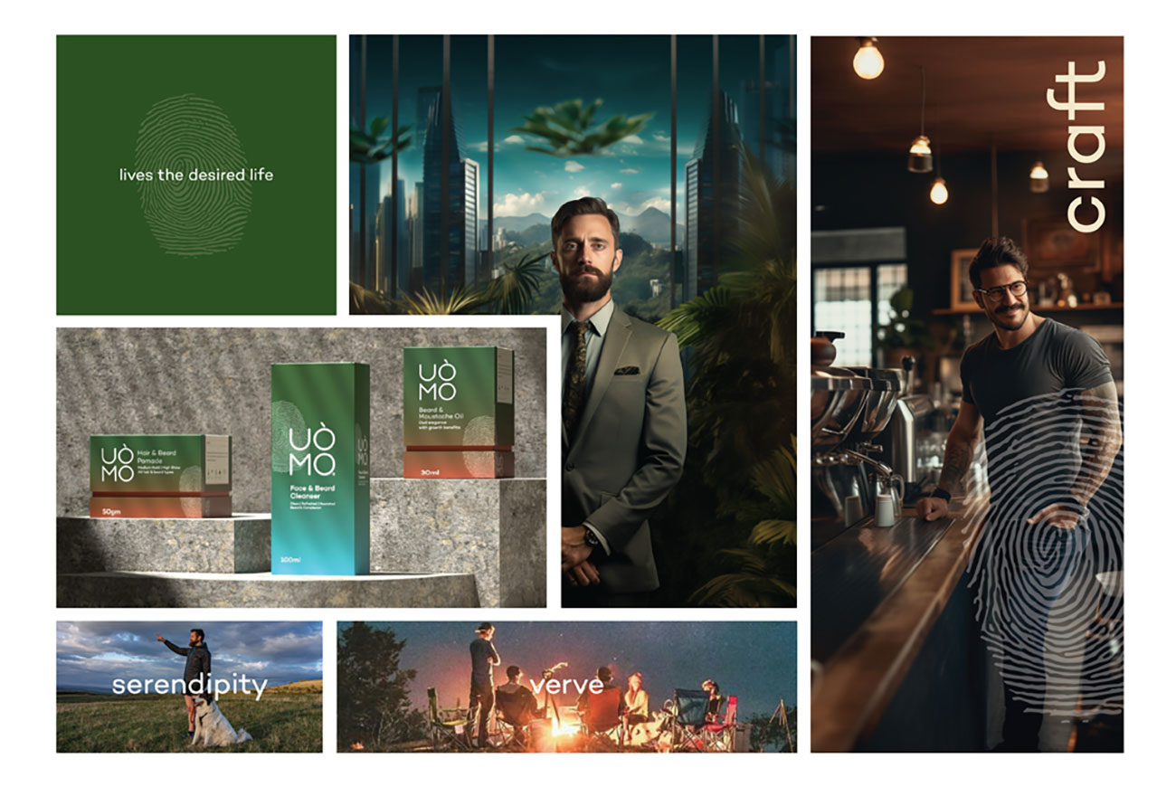
The design idea was rooted in the brand’s founding belief: Grooming is personal.
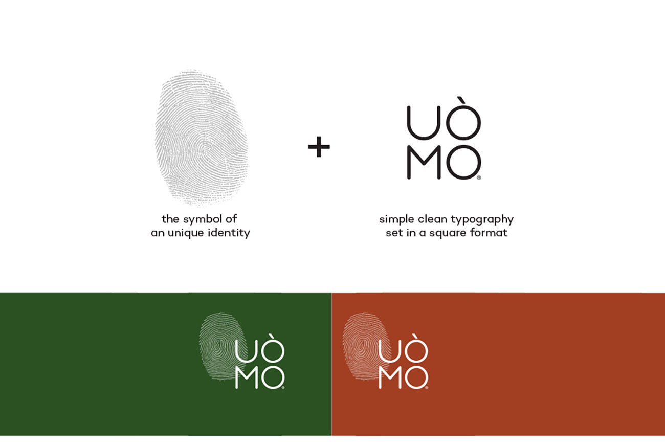
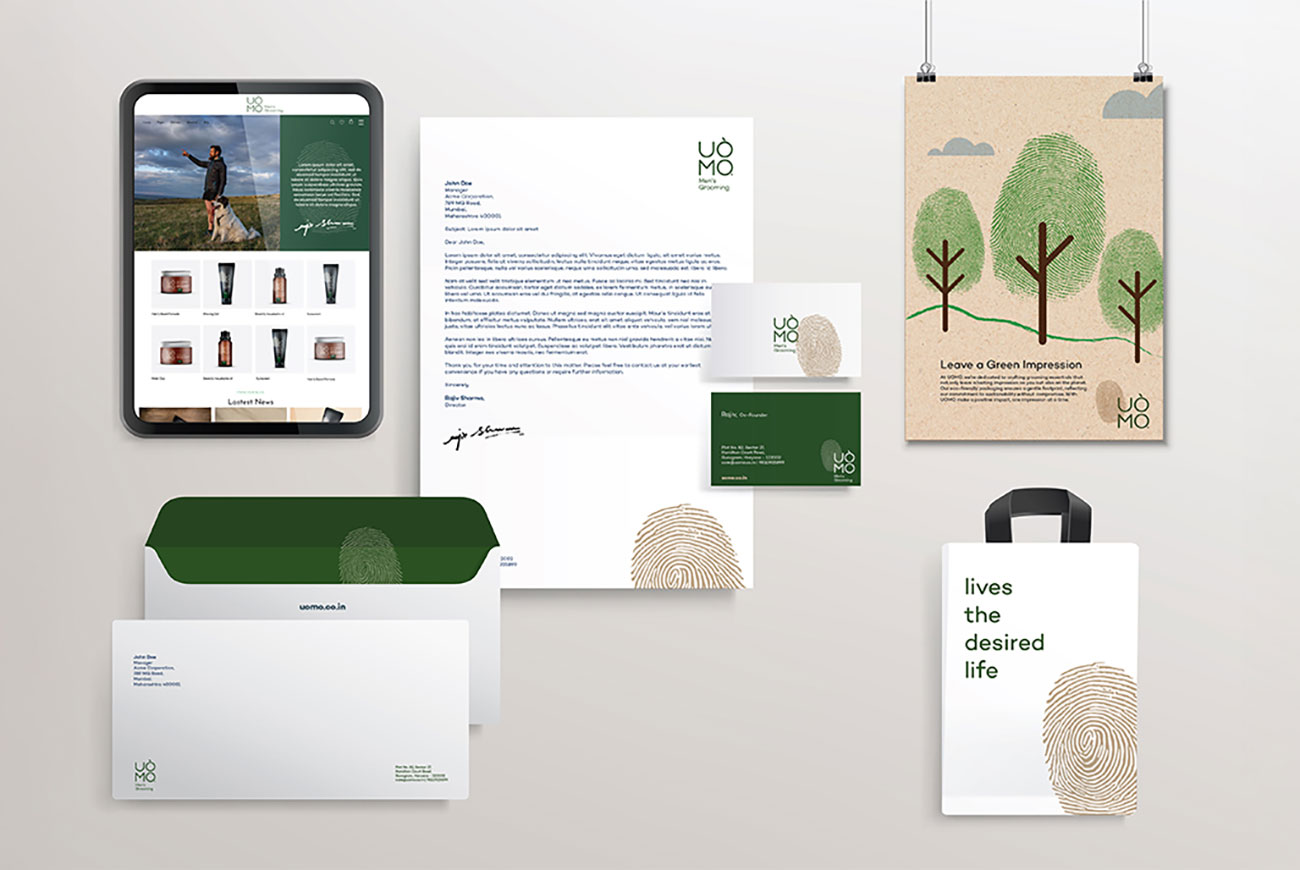
UÒMO’s identity centers around a thumbprint—a bold, graphic symbol of individuality. Paired with a minimal, square-set logotype, the branding expresses quiet strength and authenticity.
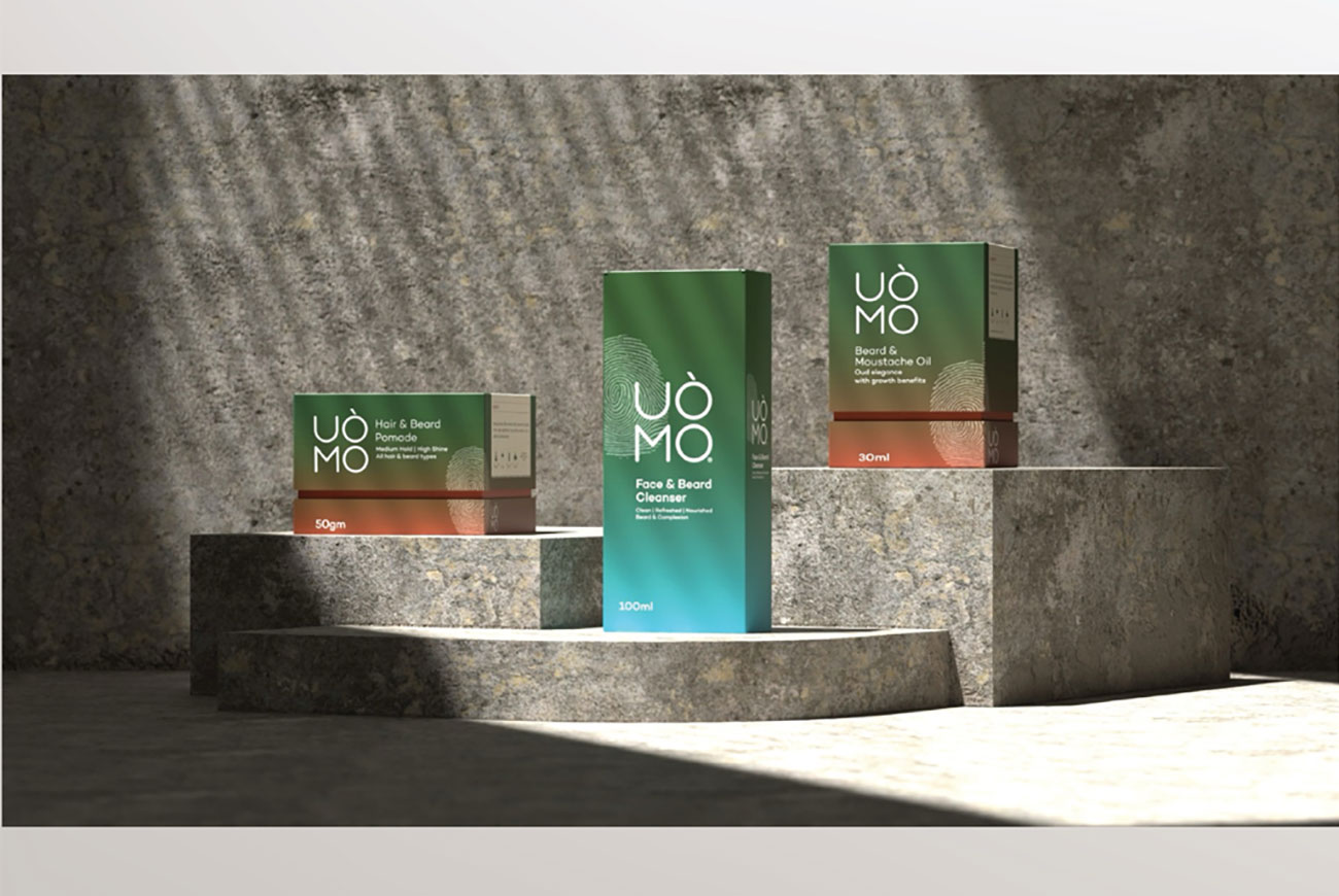
The campaign “Leave a Green Impression” extended this symbolism to sustainability. Every visual choice, from the raw textures and muted, nature-inspired palette to the bold yet minimal typography, reflected purity and intention. Packaging was created using recyclable materials and reduced ink usage, with clear communication around clean formulations—no harsh chemicals, only responsibly sourced ingredients.
The message was subtle but clear: True individuality is not just how you look—it’s how you choose.


